It can take a lot to pull a room together; from the planning and creating timelines to budgeting and making final purchases, there are many many components that factor into interior design. Since I first began working with clients and walking them through this process, I have acquired a few tips and tricks that you can use to make it a little easier. Can’t afford to hire an interior designer? Here are a few of my personal tips on how to decorate like one!
Invest in Statement Pieces
Decorating is an expensive endeavor, so it is important that you make savvy decisions when it comes to what you splurge and save on in your home. Building a look around a statement piece of furniture or artwork is a great jumping off point, and most homeowners already have an existing piece of furniture or artwork of sentimental value to them that they would like to keep in the space. From there you can begin to pull colors and coordinates to tie everything together in a purposeful way.

image source
If you are starting from scratch or don’t already have that one piece of inspiration, don’t be afraid to go find something special that you are willing to spend a little bit more money on to build your room around, like this great statement rug shown above or a fabulous piece of artwork. It is smarter to splurge on the things you will love for years to come and save on the smaller, secondary or more temporary details of the room!
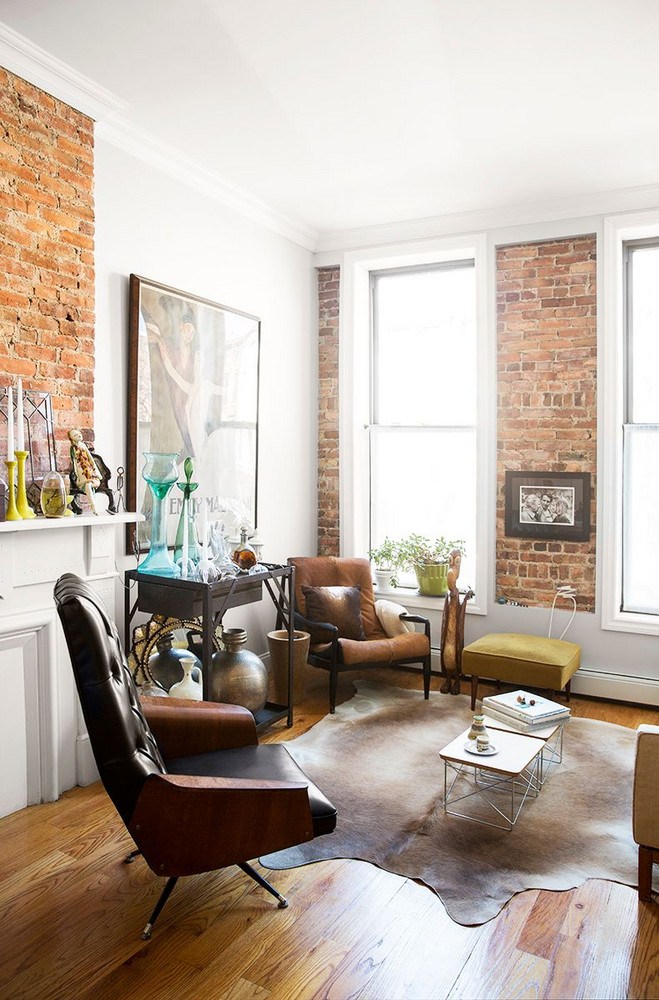
Create a Color Story
The colors of a room are by far one of the most important aspects and are indicative of not just the look you are going for but the feel. I find the most common error my clients make is feeling as though they need to be matchy-matchy with their color choices. This can give your room a one dimensional, cookie cutter feel, so be sure to mix in various hues and tones to create more visual interest and depth. Here are my 5 tips for picking your color scheme:

image via domino.com
- Choose your main or primary color first for medium areas of the room like drapes, area rugs, or bedding.
- Pick your secondary color next, this will be used as the accent in the room on things like pillows or accent chairs. For a bolder look choose a color opposite your primary color on the color wheel. To keep things more minimalist and monochromatic, choose a color within the same family.
- Tertiary color is next, and will be used in accessories or even plants that can be sprinkled throughout the space to serve as a fun pop. Since this color will be used in smaller doses, don’t be afraid to go bolder here!
- Pick your neutral color, which will be used on the more dominant areas like the walls or larger pieces like sofas and chairs. Keep in mind that neutral doesn’t always mean beige, tan or grey.
- Bonus* If you’re going for a more monochromatic look, pick one color and work with various shades and tones to create depth and interest.
Create Texture
Visual interest can come from more than just color! Using different materials to create texture in the room is a largely important part of interior design. Rugs, throws, pillows and furniture pieces are the main use for textiles, but there are also great wallpaper options out there to bring texture up onto the walls as well. Think grass cloths, mixed metals, leather, linen, or even fuzzy pillows.

image source
The textures used in the space, much like color, are used to further convey the feel of the room. Glass, stone, and metal surfaces make a space feel more industrial, while organic woods, natural fibers and softer hews work to soften a room and create a cozy and comfortable atmosphere.
Never Underestimate the Power of Artwork
Naked walls are a surefire way to make a room feel incomplete, and wall art can also be one of the more difficult aspects to a room, but boy does it make all the difference when you get it right! The biggest mistake people make when it comes to purchasing or hanging art is scale. Too small and it looks like an after thought. Too much and it looks cluttered and cramped. A general rule of thumb is to never select a piece that is wider than the piece you are putting it above, as seen here.

image source
When hanging multiple pieces of art or photographs in more of a gallery wall fashion, try to keep them within the lines or width of the piece below it as well. Otherwise it will look top heavy and imbalanced. Once you’ve selected your piece, try to pull some of the colors and sprinkle them throughout the room like they’ve done here with these great white checkered pillows!
Make It Yours
I always use one of my clients, Dee, as an example of this. Last year Dee walked right into the showroom with her bright fuchsia lipstick and Kelly green coat and told me she needed my help fixing her living room. Reason being? She went with what was trendy instead of what she liked. This woman who loved and embraced color had found herself with an entirely grey room that bored her to tears. She was so concerned with being “on trend” that she neglected to make it a reflection of her vibrant and colorful personality. Unfortunately her mistake had cost her more than a pretty penny!

image source
It is easy to flip through the pages of a magazine, scroll through Pinterest, or read up on other blogs and pick up on the current trends being used, but that doesn’t necessarily mean you are obligated to follow them! Your home is where you spend a vast majority of your time and should be a place that makes you feel good. Most of us aren’t living in a room that is featured in the pages of a magazine. Trends shouldn’t dictate your home! Focus on what you like and forget about the rest. That is the most important thing to remember when designing your home, in my opinion. How boring would my job be if everyone was the same?
xx Kelly
*Featured image via domino.com


